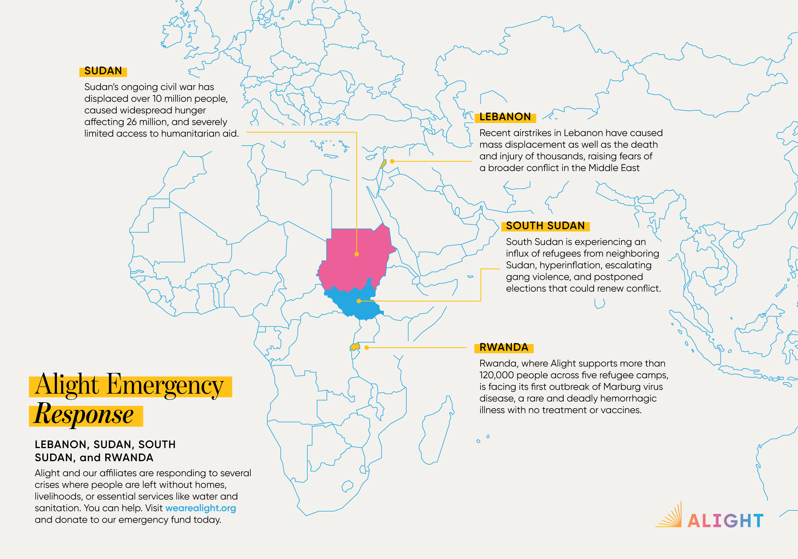
I created a branded map system for Alight for ease of staff customization and readily accessible, branded assets.
Quickly after I began my position as Senior Graphic Designer, Global at Alight, I began to comb through assets to refine and organize branded visuals. One gap I noticed right away was the lack of uniform, branded map styles for staff use in internal and external presentations and documents. Knowing Alight needed to be nimble during times of emergency response, I initiated a branded map project.
As the sole designer for the organization, I decided to purchase an accurate world map graphic from Creative Market to save time and have a solid base to build off of. Once I downloaded the map, I was able to customize the look with Alight's brand colors. I conducted some user interviews with different staff members to figure out the most useful types of maps for Alight's purposes, and came up with 4 different styles per country, plus a few different versions of world and continent maps. I also created map location markers and exported those for staff to customize their presentations or documents if they wanted to pinpoint a specific area without having to go through me, effecrively making map templates. I launched the series of maps as an organization-wide tool with about 100 exported visuals ready to use.
These maps were successfully adopted by key internal stakeholders to use in pitch decks, annual reports, 1-2 pager information packets, and emergency response appeals and the Alight website. They've been particularly handy for speeding up emergency response graphics, empowering our staff to confidently send out communications about specific countries and areas when it's needed most.
